Seasonal Color Analysis, Demystified: Finding Your Palette Without the Price Tag
Color analysis went from 80s parties to viral obsession — the seasons, the draping videos, the hundred-dollar consultations — and the useful core is learnable at home: the undertone, the depth, the colors that make your face light up. The demystified guide.
The System Explained
What color analysis actually is: the premise (the personal coloring — skin undertone, hair depth, contrast level — interacting with clothing colors; the near-face colors either illuminating or draining per the color logic), the seasons framework (the warm-cool axis crossed with light-deep and clear-muted — the spring-summer-autumn-winter shorthand; the twelve-season refinements for the invested), the what-it-predicts honesty (the system describing TENDENCIES — the best-versions-of-colors guidance more than bans; the every-color-has-your-version truth: the right red existing for everyone), the evidence calibration (the analysis being observational craft, not science — the useful-tool framing; the viral certainty dialed down per the honest logic), and the why-it-helps case (the shopping filter value — the wardrobe cohesion from a defined palette per the capsule logic; the expensive-mistake prevention).
The DIY Method
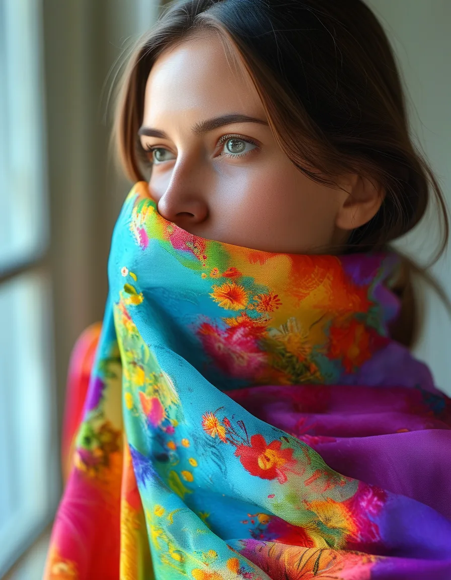
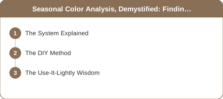
Testing at home: the setup requirements (the daylight window, the bare face, the neutral background — the hair pulled back; the conditions mattering more than the tools), the undertone tests (the vein check being rough — the silver-versus-gold jewelry comparison; the white-versus-cream draping being the cleaner test: the one that brightens versus the one that yellows-or-grays you), the depth-and-contrast assessment (the hair-skin-eye contrast observed — the high-contrast winter tendencies versus the soft-blend summer; the photo-in-grayscale trick), the draping sessions (the fabrics-or-clothes held at the face — the watch-the-FACE discipline: the color judged by what it does to skin, shadows and eyes, not by whether you like it; the phone photos for comparison), the season triangulation (the results mapped to the nearest season — the between-seasons normality; the close-enough palette being plenty per the practical logic), and the professional option (the in-person analysis for the curious-and-funded — the DIY being eighty percent per the budget logic).
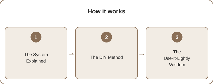
The Use-It-Lightly Wisdom
The palette as a tool, not a prison: the near-face priority (the palette enforced at tops-scarves-and-coats — the bottoms wearing anything per the placement logic), the best-version shopping (the loved color found in YOUR version — the tomato-versus-burgundy red decision; the palette adjusting shades, not banning hues), the wardrobe application (the palette-aligned capsule cohering automatically — the everything-pairs bonus per the palette logic), the confidence override (the color that makes you FEEL powerful outranking the chart — the analysis serving joy, not policing it per the joy logic), the makeup-and-hair interplay (the coloring changed by hair decisions — the gray transition from the gray logic re-running the analysis), the trend translation (the season’s it-color worn in your version — the trend logic filtered through the palette), and the closing frame (the analysis demystified to one skill — the face watched while colors audition; the palette found in an afternoon, used as a filter, overruled by joy; the colors, chosen to light you up). Daylight, bare face, watch what the color does to your skin: the palette, found at home.
The learnable core: in daylight with a bare face, drape colors and watch what they do to your SKIN — brightening versus yellowing-or-graying (white versus cream is the cleanest undertone test), then map your contrast level. Use the palette lightly: enforce it near the face, find your version of every loved color, and let joy overrule the chart.
Keep Reading
This article is for general styling and informational purposes only. Trends, sizing, availability and pricing may vary by brand and season.